
GUIDELINES AND ASSETS
Chrysalis Brand
The goal of this page is to assist internal teams, vendors, partners, and media with using the Chrysalis branding elements to convey a consistent brand image across all the formats and communication channels.
Chrysalis is providing access to use the logo and the branding elements solely in accordance with this manual.

INSPIRATION
A Different Kind of Company
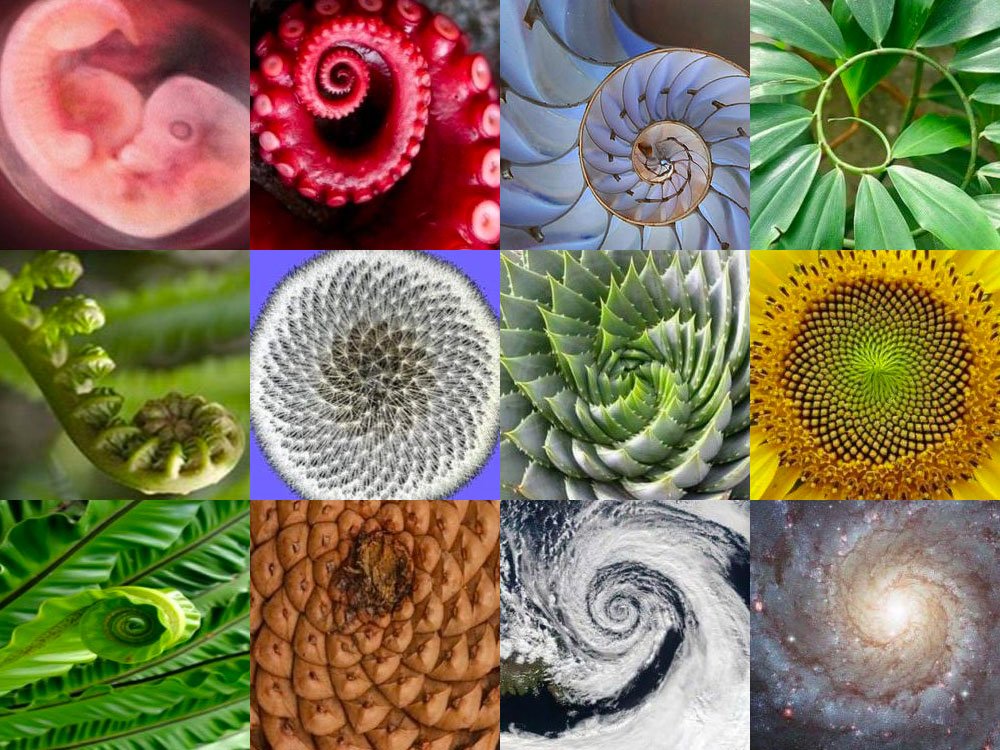
The nature of Chrysalis as a meta company is to provide environment for the emergence and growth of new companies, just like those processes happen in biological world we inhabit.
Those patterns are easily visually recognizable, displaying a spiral or a set of intersecting spirals, as well as having many units in the set that build one larger whole, signature elements of the recursive processes appearing everywhere, from the origins of life to the wholeness of life.
That is the kind of role Chrysalis is playing in the ecosystem of Chrysalis people, companies, partners, markets, etc. - the role of facilitator of emergence of new entities that carry the same DNA.
Logo
The cornerstone of our brand is the Chrysalis logo, more precisely the Chrysalis symbol.
For all the reasons described above, it is a play on the spiral and particles theme, a design generated algorithmically to mimic similar natural designs. The golden-orange colour of the symbol is informed by the origin of the Chrysalis word, coming from greek χρῡσός, chrȳsós - meaning gold.
The wordmark is a mod of Museo Sans 700 sans serif with a gentle nod to the slash character, one of the most used characters in IT technologies.
Versions of the logo
Chrysalis logo comes in a few variations used in an appropriate context.
The colour logo is used over white or off-white backgrounds, in the contexts where the brand is a primary feature, both internally or externally.
The black (and single tone) logo is used when the smaller formats are needed in a layout and the legibility needs to be amplified.
The white logo is used over the black, dark, and photo backgrounds.
Colours
The Chrysalis brand uses a combination of colours, of warm and cool tones, that invoke natural environments, hence their names. Gold is our primary colour.
Avoid using the whole palette in a layout unless it’s needed for an infographic or data visualization.

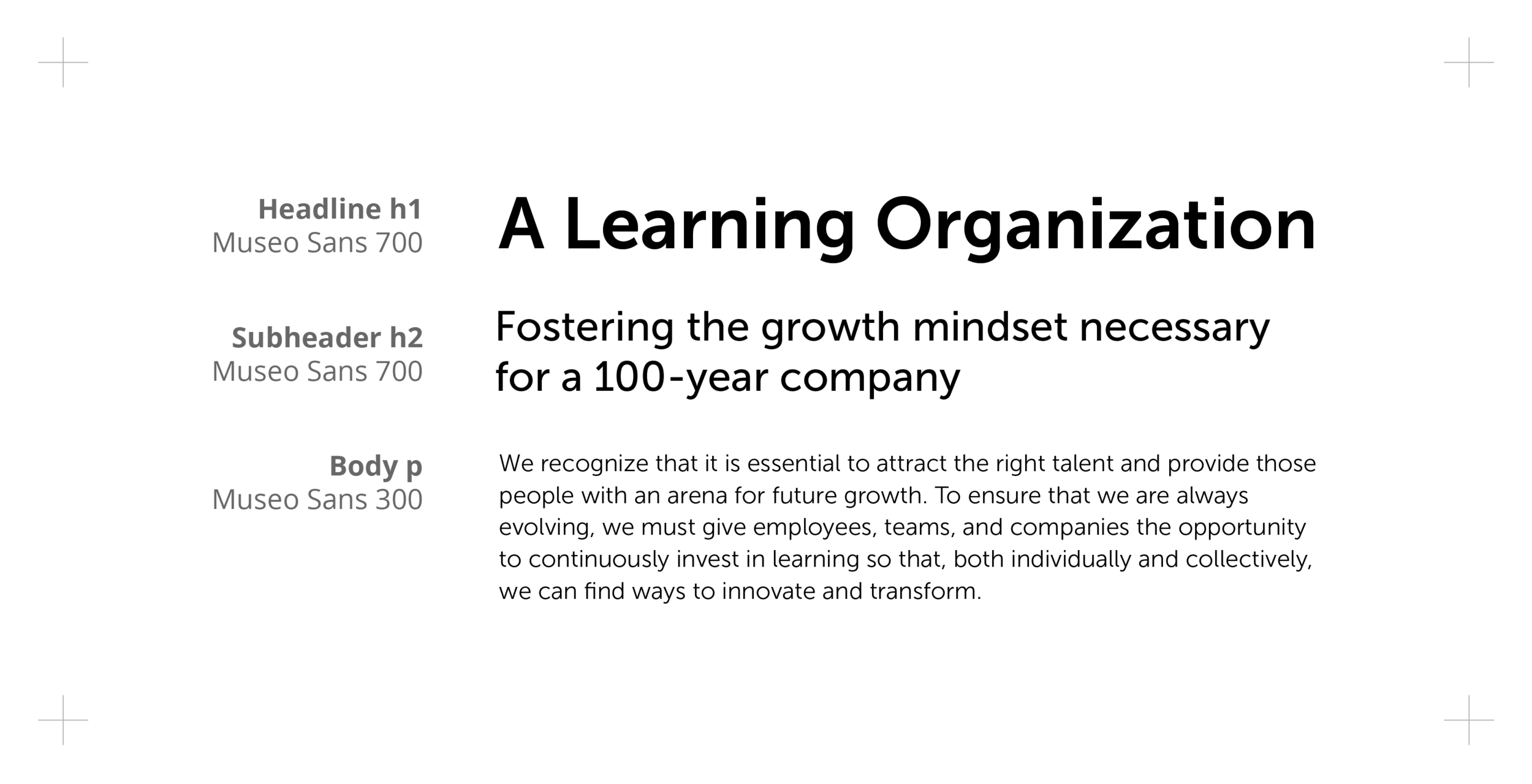
Typography
We use the Museo Sans typeface family whenever possible. Headers are Museo Sans 700 (a brand colour can be used if needed to distinct sections), subheaders are Museo Sans 500 and the body text is Museo Sans 300.
Alternatively, if Museo Sans is not accessible for all formats and users, we recommend Microsoft’s Calibri font for internal use eg. PowerPoint decks or Word docs.
Photography
The vision of the Chrysalis brand is Art of Being Human, therefore our photography focuses on people from our organizations and communities we are a part of. Photos can be used unprocessed or with brand colours surface overlays (eg. for better text legibility).